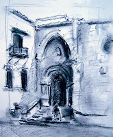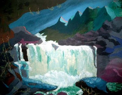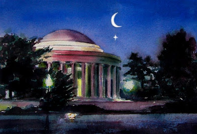

You can see his website here Top left is my photo reference. Top right, the value study. Today's challenge was to paint beyond the boundary of the objects in the reference photo creating new shapes, and to use fresh color. Normally, I do a very detailed drawing which takes hours and spend over 20 hours on a half-sheet sized painting. In Eric's workshop after a morning demo by him, we do a value study which takes about 20 minutes, and then spend two hours on a full-sheet sized painting which is approx 21" x 30." No time for too much detail. Really forces you to concentrate on the important shapes and colors. Plus it's fun! Eric is a great teacher. Has great advice and good individual instruction for each workshop participant. I recommend him highly.


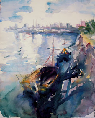
 I'm taking a wonderful 4-day workshop with Eric Wiegardt, AWS NWS, author of "Watercolor Free and Easy." Today was day one. We brought our own photos of boat scenes to paint from. Eric stresses that values are more important than the color in a successful painting, so we all did value sketches before beginning. Also, today's challenge was to be more free when mixing colors....to merge colors on the palette and on the paper, rather than creating a finished color to put directly on the paper. Top left is the reference photo. Top right is the value study. We all did very loose, wet-in-wet paintings on full-sheet, 21" x 31" 140# rough watercolor paper. Eric's style is loose, yet skillfully controlled. We tried to emulate. He instructed to find the pattern first of light and midtones. Think about the design of the painting. Refer often to the value study over the photo. You can't think about design when your mind is on the photo. My work today resulted in a 2-hour, approximately 70% complete painting. Most of the values and shapes are in. Some detail in the figures and shadow strengthening are yet to be finished. All-in-all a fun and informative day. Looking forward to tomorrow.


